MTG cares more about collectability than accessibility - and it’s making the TCG worse
More than meets the eye.

Magic: The Gathering is one of the most complex trading card game systems to ever exist. With over 20,000 unique cards printed, ensuring the visual legibility of the cards to go along with the game functionality is key, for not only existing players but to invite new players into the hobby. Over the last few years, Wizards of the Coast's visual design is pursuing an alternative goal from that of game design. Even with the ever-growing presence of MTG Arena, the desire to play Magic: The Gathering on tabletop remains strong despite the pandemic reducing tabletop events. And while it seems plenty of the visual design elements are influenced with Arena in mind, it is leaving some players feeling alienated from a game they love dearly.

Since the release of Throne of Eldraine in 2019, almost every new set - or a collection of new cards, released every few months - brings a unique twist on the Magic: The Gathering card frame, otherwise called the showcase frame. On these showcase cards, the art and frame will play into the theme of the set to provide additional flavour to those cards. From the perspective of a new player, this detail can lead to misinterpretation because there are so many visual cues to keep a track of, all whilst playing a complex card game. You don't want to overwhelm a player with a new game system before they even pick up the cards, and this is where the importance of visual accessibility comes in.
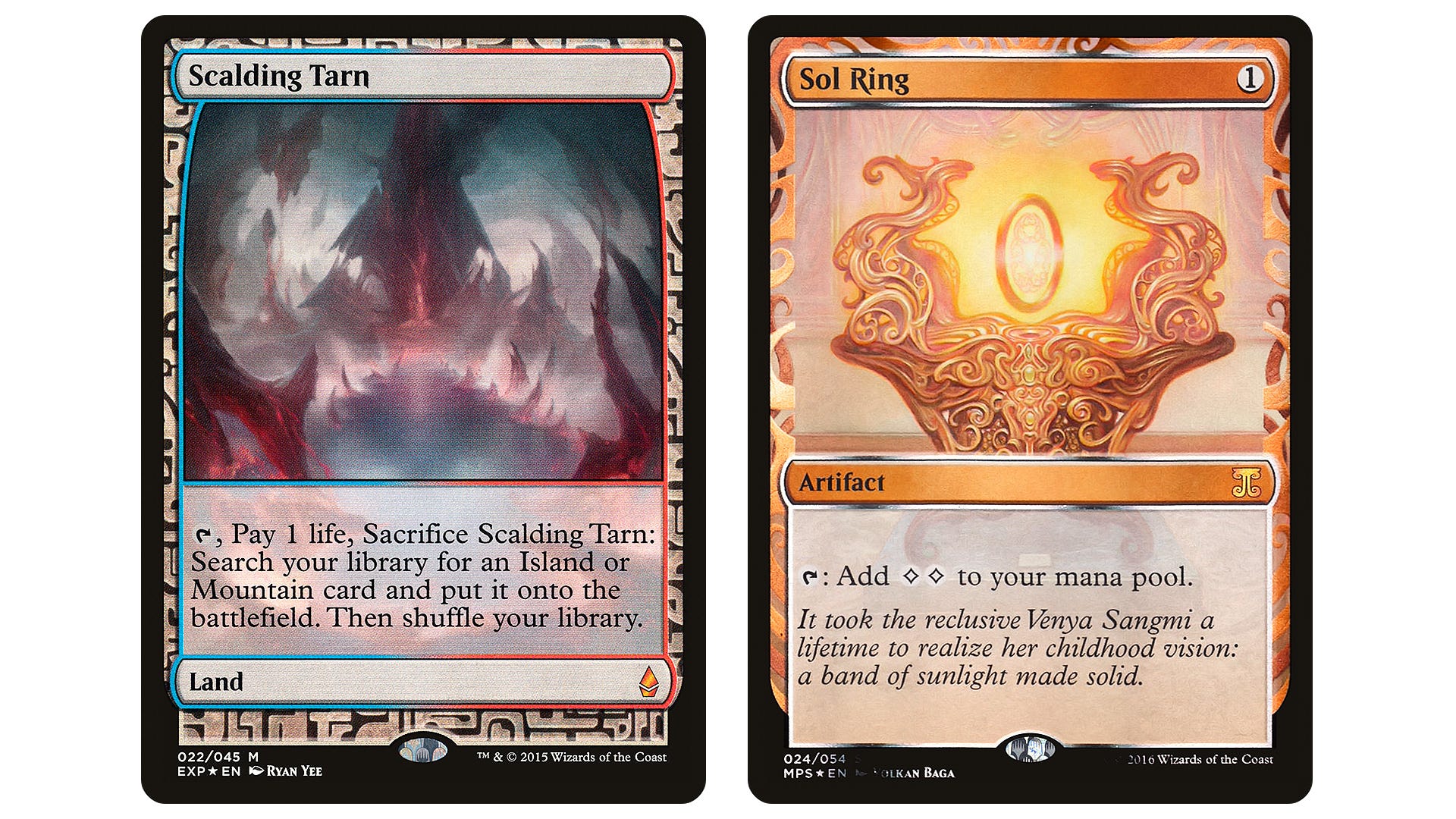
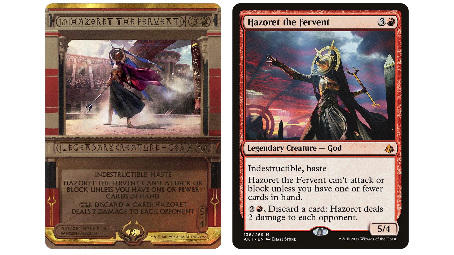
Previously, these distinct treatments were seen as novel as there were so few in circulation so it didn’t impact visual accessibility or tabletop play in a meaningful way. It began with Battle for Zendikar and the Masterpiece series, a set of highly rare special frame cards which were randomly inserted into draft boosters during the 2015 set release. Through this series, it raised the question of ‘what a Magic: The Gathering card should look like’, with the Amonkhet Invocation cards resulting in polarising opinions since the cards are difficult to read on first look. However, given how few are in circulation, the discourse around accessibility didn’t last long.
It's clear that Wizards of the Coast wanted to push Magic: The Gathering into a collector space, given the trends seen with Pokémon and the introduction of the Collector Booster within the set release range. Before, these cards were usually seen as innovations, a marketing tactic for players to buy more packs, or to marry identity to the player's outlook of the game. However, each new execution of a temporary brand new design layout for an upcoming Magic: The Gathering set makes the game less cohesive. Wizards of the Coast are sacrificing basic game identity in exchange for marketing, which in turn is damaging player accessibility and leaning towards a space for collectors instead. From Standard sets such as Streets of New Capenna to the myriad of Secret Lair drops, it's impossible to keep up with the different frames when playing the game and sometimes, those different treatments can leave an unfortunate playing experience for those who struggle with reading or understanding colours. This isn't coming from only a competitive standpoint to only use obscure-looking cards to gain an advantage on your opponent, but more for players to be able to translate these cards easily and to remove any additional bandwidth to an already complicated game system.
The Double Feature visual designs break the basic concept of Magic: The Gathering.
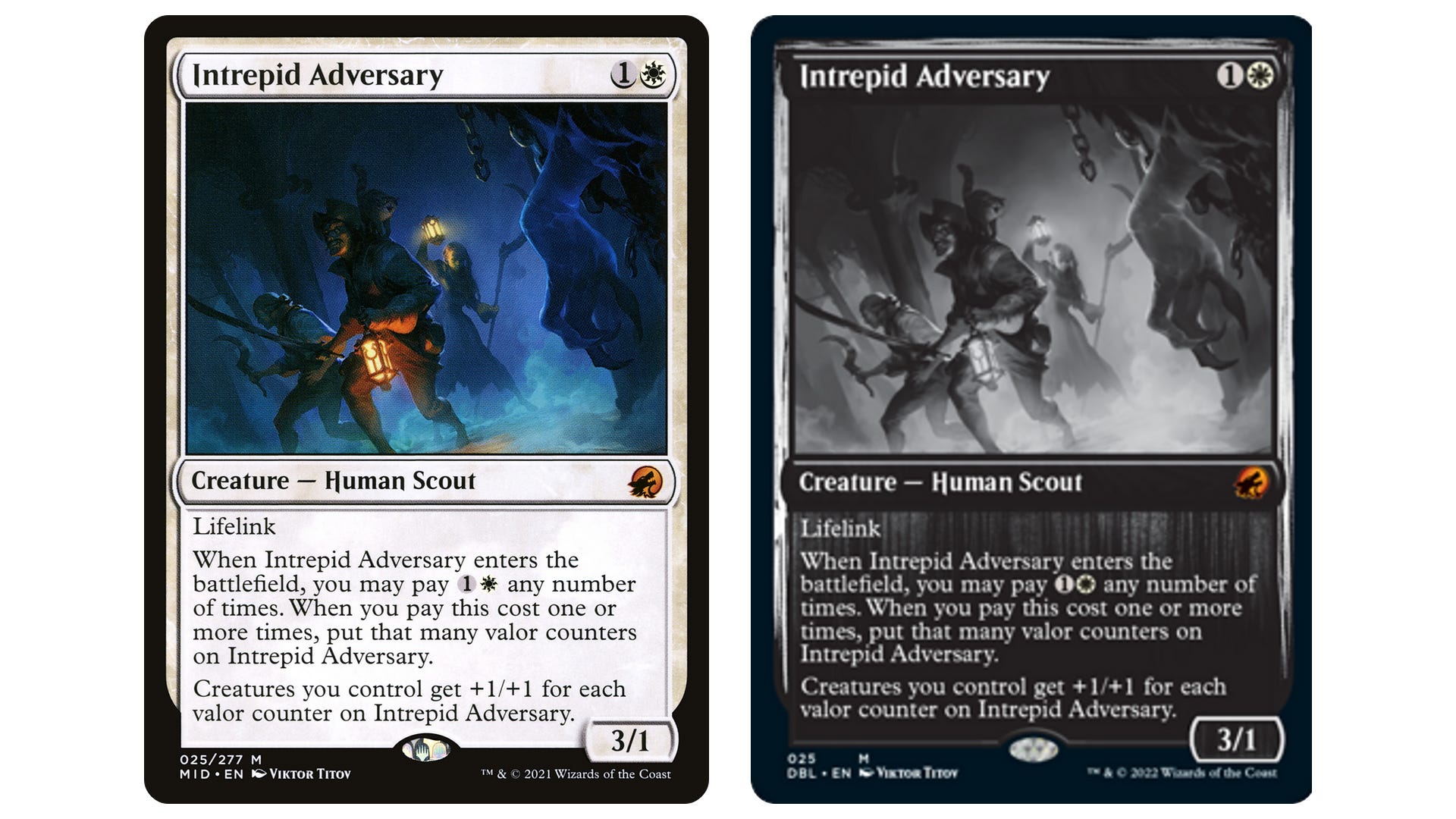
Innistrad: Double Feature - a booster-based compilation draft set featuring cards from both Innistrad: Midnight Hunt and Crimson Vow - served as a catalyst for the card frame discussion earlier this year. To standardise the overall horror theme of these sets, Innistrad: Double Feature offers a special black-and-white treatment to reference old-school monster movies. Despite the concept offering promise, the execution is poor with little thought for visual functionality and understanding for the players.
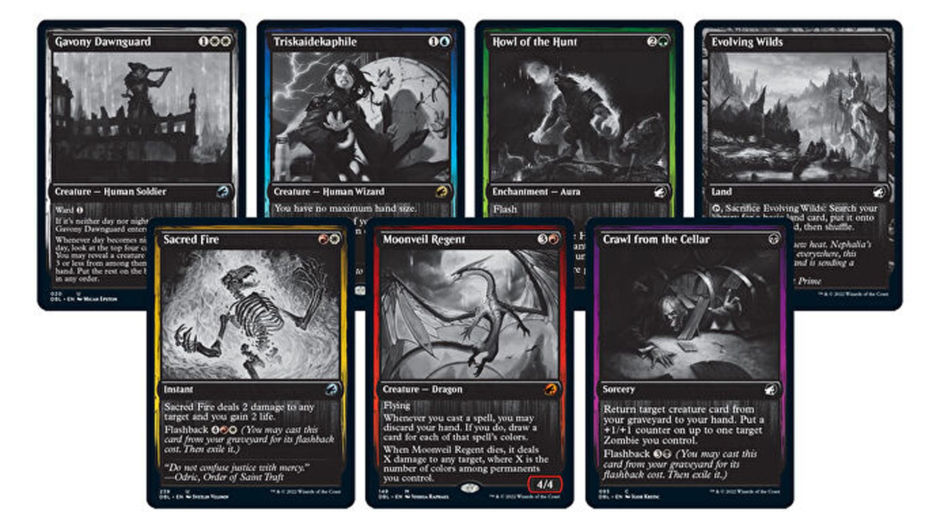
The Double Feature visual designs break the basic concept of Magic: The Gathering that players have to adhere to given the functionality of the game. Traditionally, the mana cost (identified in the top right corner of the card) is in relation to the five colours within Magic – White, Blue, Black, Green, and Red. By knowing where the mana cost of the card is located, it enables players to cast those spells and know which colours of mana to use. By shifting the cards into a monochromatic colour scheme with a coloured thin outline to do the heavy lifting simply isn't enough, especially for those who struggle with colours or are colourblind – it damages the foundation which Magic: The Gathering needs to function as a games system.

Not only do you have the issue of identifying the casting cost of these Innistrad: Double Feature cards, but the card text can also be a struggle to read. Using white text on a faded grey background means there’s little contrast to understand what the card does upon first glance. For a trading card game that needs simple designs to help progress the game state, it’s a lazy attempt to bring something different, while trying to pad out the release schedule at short notice.
In my opinion, this is an element that designers should not ever tamper with given how important it is to the game design of Magic: The Gathering, it also maintains consistency for those who have visual difficulty with cards. Granted, there are benefits to having various unique card frames as they promote better card circulation, which means these cards can become more affordable long-term.Financial accessibility is a common issue with Magic: The Gathering and having multiple copies of the same named cards allows players to acquire them more affordably. However, there is a fine line between financial and visual accessibility, and you don't want to compromise the latter by encouraging the former.
As new players come into the hobby with every set release, it’s key to keep the fundamentals down without chasing the marketing high.
It's obvious that there is a demand for these unique-looking cards given the emphasis on the collectible aspect in MTG over the last few years. However, Wizards of the Coast need to start reigning it in if they want to keep its gameplay identity, which is what made the trading card game so popular at the beginning. With Warhammer 40,000 and Lord of the Rings coming to MTG in the next few years, visual accessibility in Magic: The Gathering is more important than ever. Through these collaborations, it's key to keep the visual design consistent so new players can play the trading card game without feeling confused or alienated. As new players come into the hobby with every set release, it’s key to keep the fundamentals down without chasing the marketing high, which will only alienate new and enfranchised players over time. Striking the line between visual and gameplay accessibility is a tough target to hit, but if Innistrad: Double Feature is the start of a trend then it’s a target that Wizards of the Coast will continue to miss.