The best board game box art you could hang on your wall
This gallery of beautiful box artwork has everything from adorable woodland critters to a noir crime scene.

When judging the merits of a board game, the aspect of box art is rarely, if ever, brought up. People will gush about gameplay mechanics, complexity, player interaction and general theme, but how a game box presents itself to its audience isn’t really part of the conversation. Which is a real shame, because if we think of board games as being like any other form of entertainment - books, films, video games - the cover can be a major driving force behind whether or not people actually want to play it.
When you’re looking for something to play at a board game café or the demo area of a tabletop convention, box art is going to be a contributing factor when deciding what you want to play. Especially if you know absolutely nothing about how a game plays, box art can - and should - give you an idea of what to expect from its contents. Whether it's the theme, atmosphere or even tone, good board game box art should be able to communicate enough to players to help them determine if they’re going to be into what it has to offer.
Best board game box art
- Camel Up: Second Edition: A re-release of a classic updates some daft-looking box art into a classy tableau befitting the game’s quality.
- Root: A list of the best board game box art would be bereft to not include something created by Kyle Ferrin.
- Wingspan: A best-seller that owes at least some of its success to the gorgeous imagery used to advertise it.
- On Mars: The dynamic use of colour in this particular piece of box art goes a long way in making an impression.
- Architects of the West Kingdom: The West Kingdom trilogy may have a pedigree thanks to its gameplay, but the box art for this entry is well worth paying attention to.
- Scythe: A masterclass in artistic storytelling can be found on the front cover of this dieselpunk-themed board game.
- Parks: It’s impossible to not be charmed by the serene beauty displayed on the box art for this game about US national parks.
- Flip Ships: Artistic brilliance and practicality merge together on the cover of this sci-fi flicking gem.
- Deception: Murder in Hong Kong: Players won’t be left in the dark when looking at the front of this particular game box.
- Skull: This box art shows how an eye catching art style can add a lot of character to an otherwise theme-light title.
Each of the entries on this list manage to provide some insight into the board games they’re advertising by using visual clues, colour and even art style. Crucially, they’re all incredibly beautiful in their own unique way, presenting a wide variety of approaches to creating box art that should make for a dazzling display on anyone’s board game shelf. Obviously, taste in art is very subjective and it might well be that you don’t agree with our picks - feel free to comment below - but this is what we believe to be the best board game box art.
1. Camel Up: Second Edition
An ugly duckling is given a fresh coat of paint in this latest edition
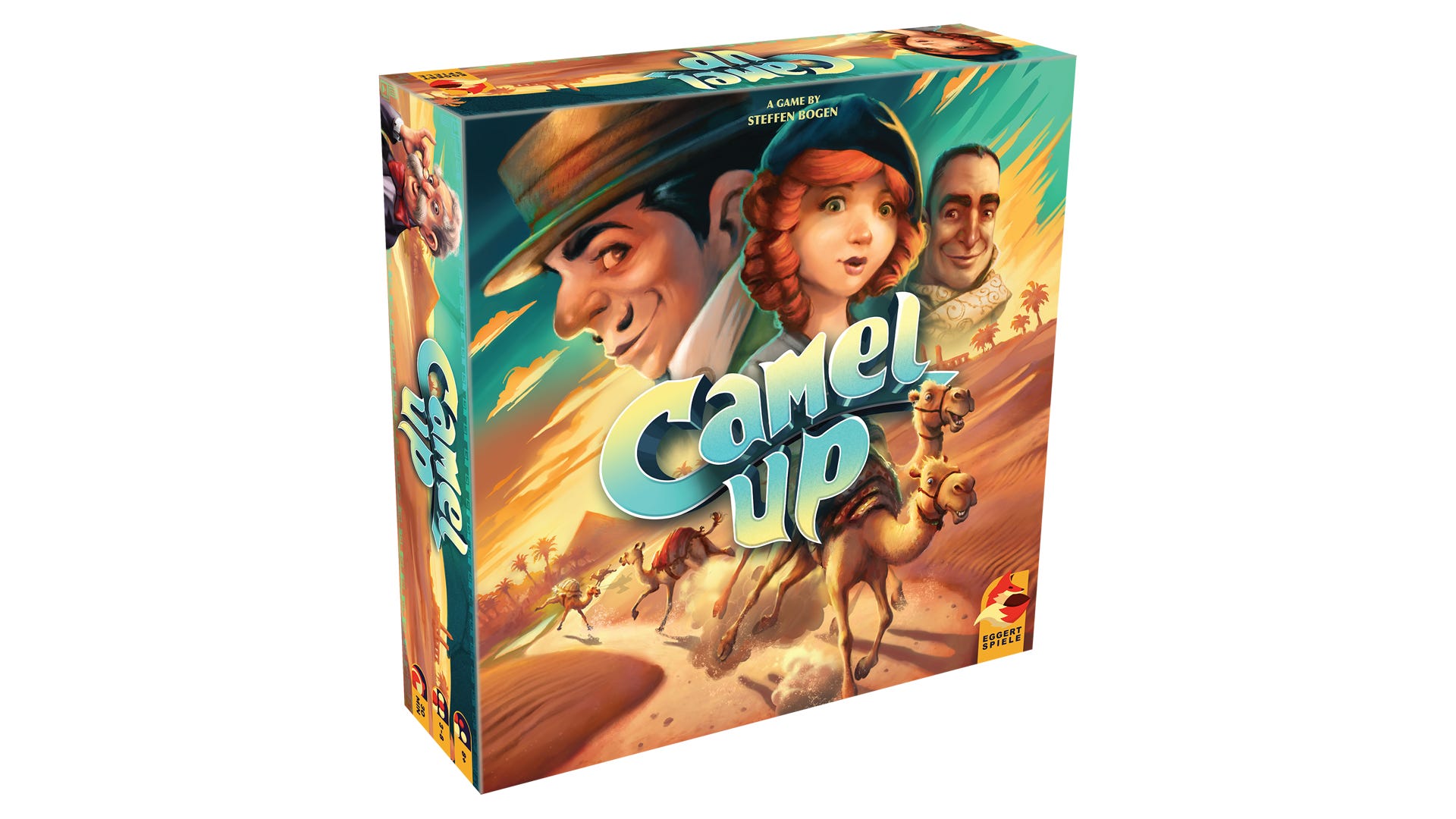
The original version of Camel Up - which came out in 2014 - had some box art of questionable quality, to be sure. Whilst it definitely captured the fun element of the family board game, it unfortunately put it in amongst the likes of Candy Land and Buckaroo in terms of visual identity - which is not reflective of the title’s gameplay. Camel Up has a lot more going on than what the original box art seems to suggest - players need to think carefully when making decisions during the game - although there certainly is still an element of wackiness to be enjoyed when playing it.
Thankfully, in 2018 a second edition of Camel Up was released, which included some new and much-improved box art. Gone were the Dreamworks-esque camel illustrations crowding the front cover, replaced by a more understated depiction of a group of adventurous individuals enjoying a bit of camel racing. Created by Chris Quilliums - who also collaborated on the art for the original edition - the new box art has an element of class to it, echoing a 1920s/’30s look in a similar fashion to the early 2000s television adaptation of Poirot’s Death on the Nile. There’s still some fun there - how could any depiction of racing camels not be fun? - but the style is much more distinctive and tasteful.
Buy Camel Up: Second Edition on Amazon US and Amazon UK.
2. Root
The talents of Kyle Ferrin are on full display on the box art for this popular tabletop title
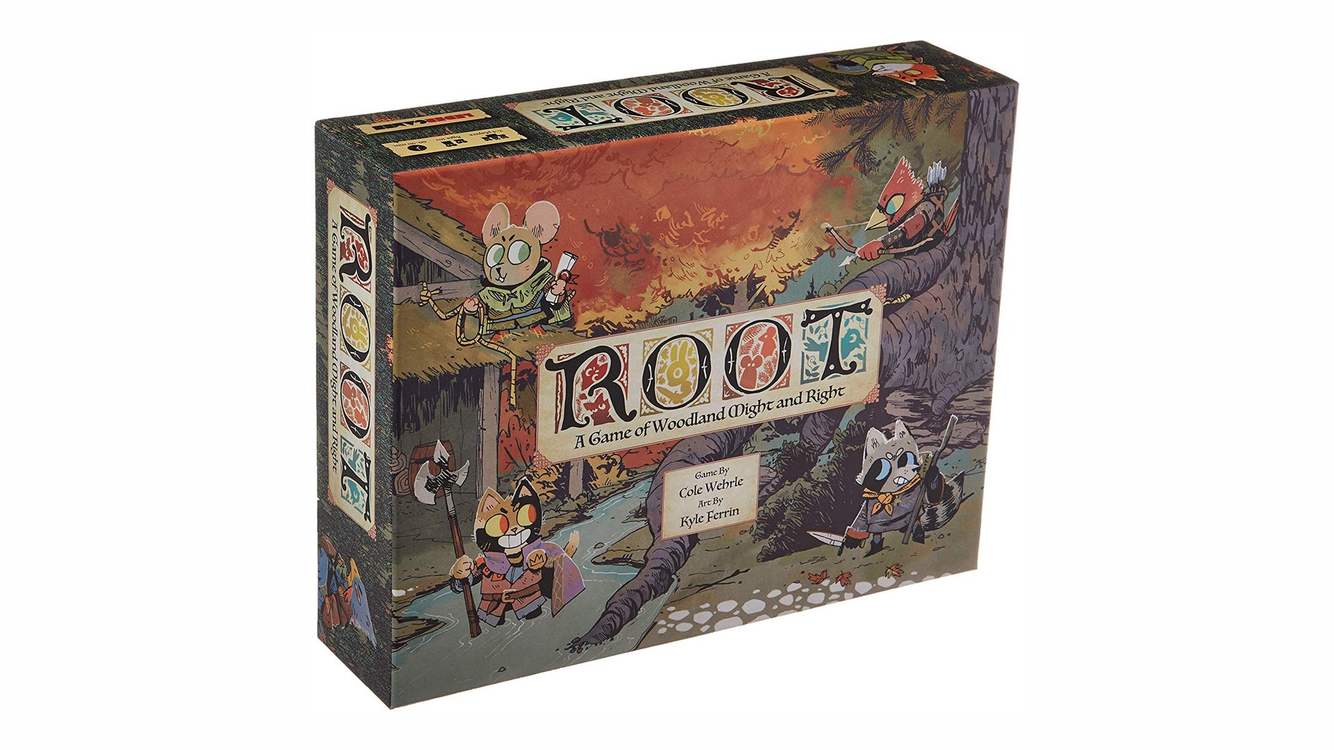
It should be a crime to talk about tabletop art and not mention the name Kyle Ferrin. The artist has one of the most recognisable styles in the entire industry, ensuring that regardless of the differences in subject matter and tone, their work is instantly identifiable. Root is a board game whose box art paints a deceptively quaint and adorable picture of an otherwise ruthless experience. Despite the savage nature of its gameplay, it’s hard to not be charmed by the box art - with its bold lines, visible shading and watercolour effects, the whole package comes together to create a truly splendid piece of art.

Whilst the box art for Root might mostly evoke feelings of cuteness, it still has some clues that hint towards its darker nature. Take in the smug confidence of the cat’s grin, the greedy smirk painted across the raccoon’s face and the bird readying their bow for a speedy kill. Nevertheless, the pastoral beauty of Root’s box art is sure to win over even the most reticent of players. And we haven’t even touched on how pretty the stuff inside the box is!
Buy Root on Amazon US and Amazon UK.
3. Wingspan
The bird-collecting board game entices players in with its extremely pretty box art
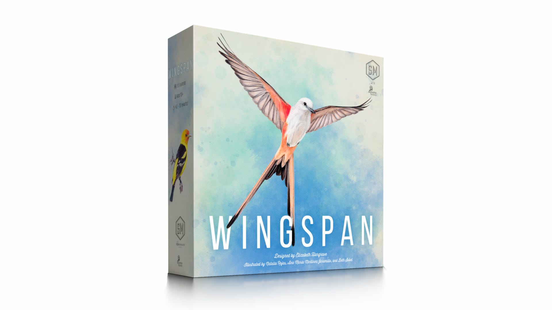
There could be any number of reasons to explain the immense success of Wingspan, with the 2019 board game outselling other titles published by publisher Stonemaier Games - such as Scythe - to become the studio’s very own golden egg. Whilst it certainly helps that the board game’s theme is so accessible - who doesn’t love a bit of bird-watching? - that its gameplay is so beginner-friendly and that it’s caught the attention of several major websites and YouTube channels, Wingspan’s astonishingly beautiful box art must have had some sway in its success.

Ana Maria Martine Jaramillo, Natalia Rojas and Beth Sobel have done an amazing job on the artwork for Wingspan, so much so that there’s even an entirely separate book on bird-watching featuring their illustrations. The box art for the game is immediately distinctive, both through the use of colour and its subject matter. Birds aren’t a commonly used theme in the tabletop industry, but the Scissor-Tailed Flycatcher on the front of Wingspan is simultaneously captivating and down-to-earth. There’s no confusion as to what’s on the box of Wingspan, but it doesn’t make it any less magical thanks to the artist’s use of pastel colours and the Flycatcher’s expressive pose.
Buy Wingspan on Amazon US and Amazon UK.
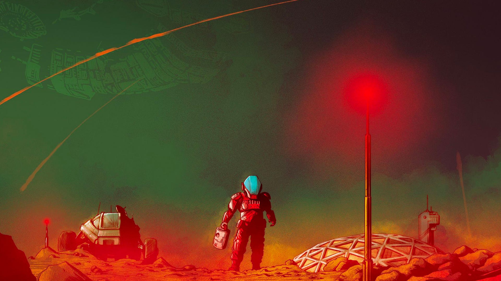
4. On Mars
Be transported to another planet through the box art of this science-fiction board game
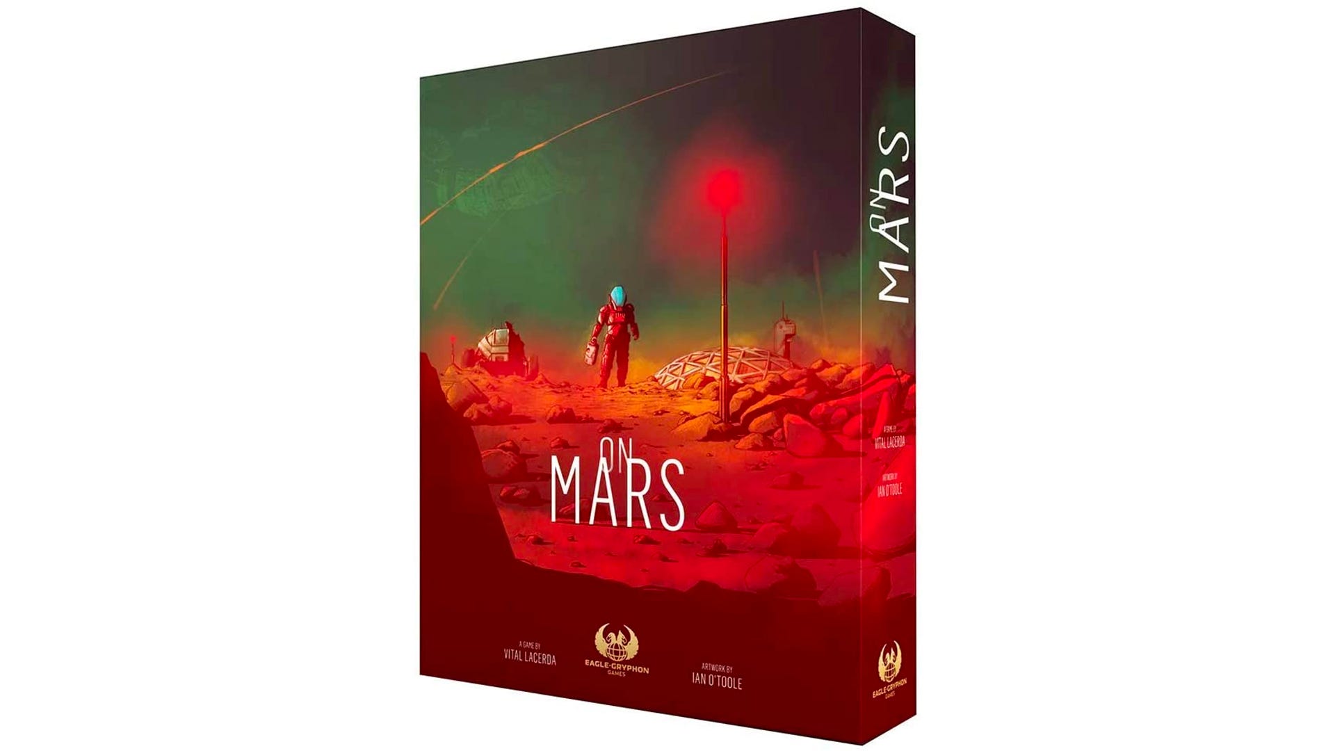
Artist Ian O’ Toole is perhaps best known for their work on historically-themed tabletop titles such as Lisboa and Age of Steam. However, the box art for On Mars proves that they have plenty of talent when it comes to depicting science-fiction scenes, as well as the historical kind.
Red, being the predominant colour often associated with the planet of Mars, has been used to its full effect on the cover of this board game. The use of different red tones creates a 3D effect, with the darker shades adding a sense of depth to the Martian environment. Red has also been misted over parts of the background too, conjuring up feelings of danger and mystery in the viewer. But the contrast of red to the deep green colours of the sky - as well as the bright electric blue of the astronaut’s visor - is really where the box art for On Mars manages to make an impression. This image could easily be found on the front of any modern album cover, poster or canvas - its design is striking enough to look good pretty much anywhere.
Buy On Mars on Amazon US and Zatu (UK).
5. Architects of the West Kingdom
This box art takes an otherwise impenetrable theme and makes it approachable
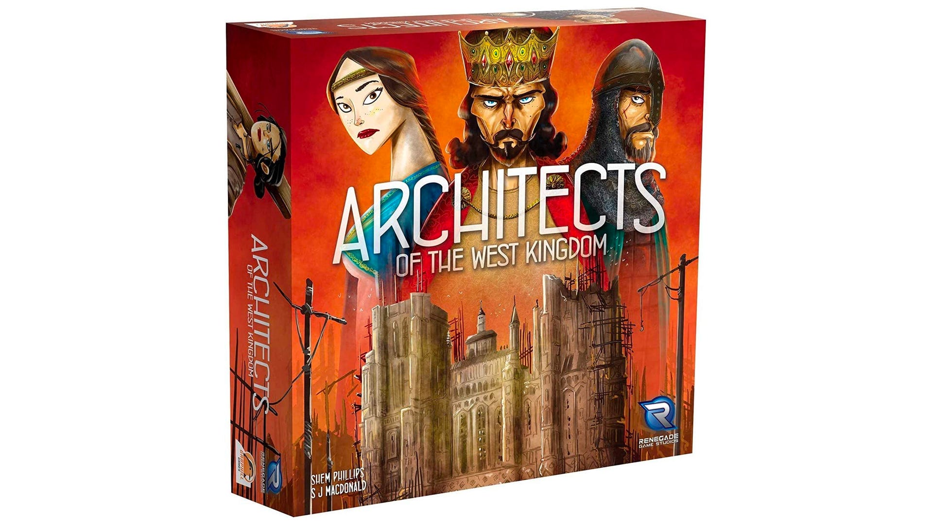
The West Kingdom trilogy tells the story of a real-life medieval empire that dominated much of Western and Central Europe several centuries in the past. Whilst ancient history isn’t exactly the most accessible of subject matters to present to potential players, the box art for Architects of the West Kingdom manages to make its theme come across a lot friendlier. Rather than opt for a more grandiose style - as box art on this kind of subject often does - Mihajlo Dimitrievski went for something simpler, focusing on just three key figures around a central image.
Despite the box art’s simplicity, it still succeeds in conveying the board game’s themes of appeasing royalty and the lust for power. The King’s glowering visage looms over a semi-constructed castle, gazing at the player with a critical eye - perhaps judging their future architectural efforts - whilst flanked by two people who appear to be his equally judgemental advisors. The characters’ stylised features give the box art a distinctive look, in a similar vein to an illustrated children’s book, whilst the rich burnt orange colour of the background makes it stand out even more. It’s wonderful to see potentially heavy historical themes, like those of Architects of the West Kingdom, be depicted in such a unique way.
Buy Architects of the West Kingdom on Amazon US and Amazon UK.
6. Scythe
Players who enjoy a strong theme need only look at this box art to find their next favourite strategy game
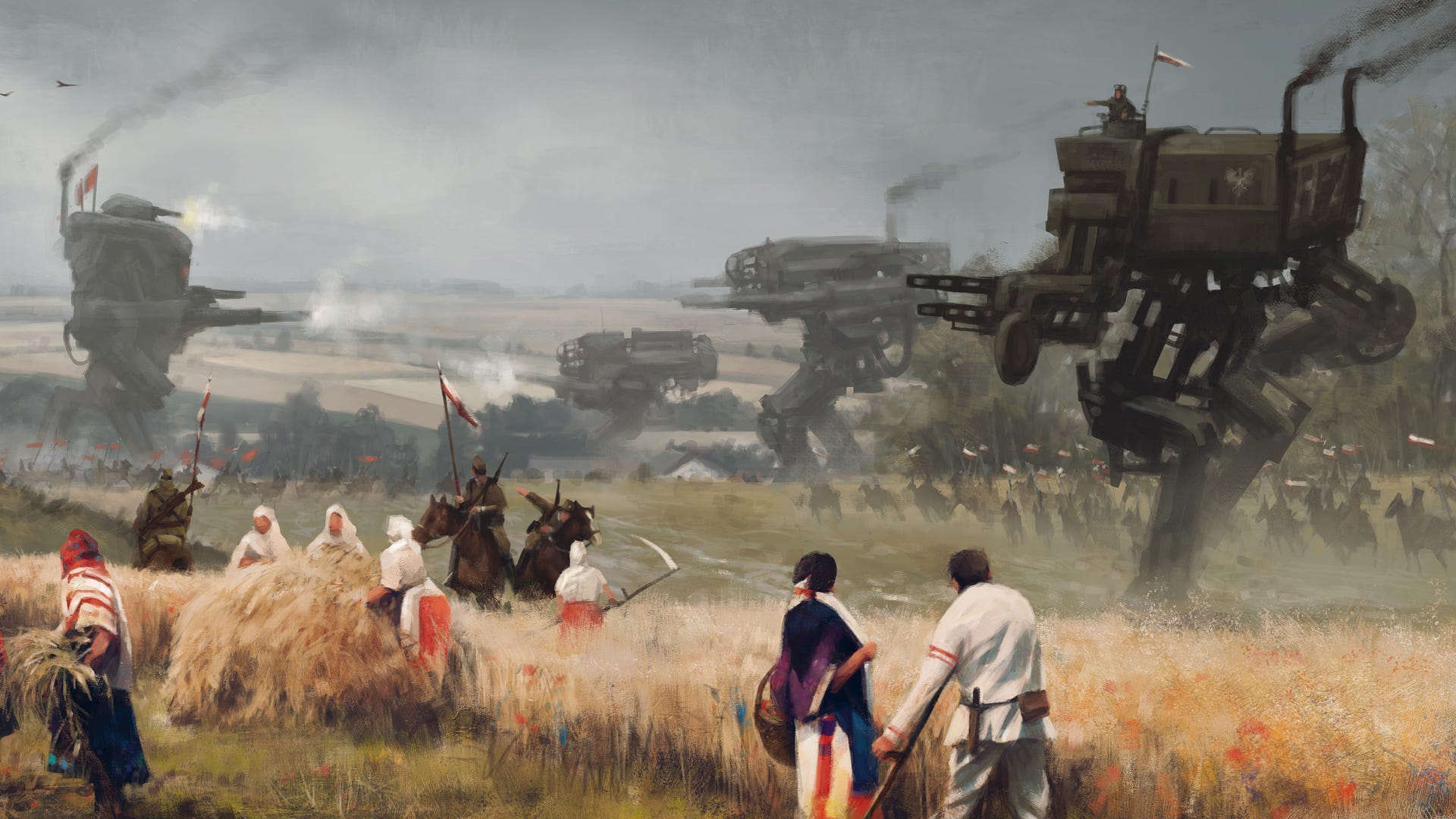
The world of Scythe is an odd one. A dieselpunk alternate history - which is an aesthetic inspired by technology of the interwar period between the 1910s and ‘50s - in which the Great War was fought using enormous mechs and trained beasts, there’s arguably a lot to take in when it comes to Scythe’s setting. Scythe does a lot of its world-building through the artwork created by Jakub Rozalski, which manages to communicate these various disparate elements of the game’s setting in a single cohesive image.
The scene on the front of the game box depicts farmers toiling away in a field, whilst a battle wages between two warring factions in the background. Rozalski has created something that wouldn’t seem out of place in the National Gallery, with their use of smoke and industrial imagery harkening back to the likes of JMW Turner. It expertly conveys the major themes of Scythe - the harshness of war and its consequences on the ordinary people who are caught up in its tracks - without being overwhelming or messy in the slightest. It’s a huge draw for players looking for a game with an arresting setting, as it tells you just enough to invite you to find out more.
Buy Scythe on Amazon US and Amazon UK.
7. Parks
It’s easy to get lost in the natural beauty of North America’s national parks with this box art
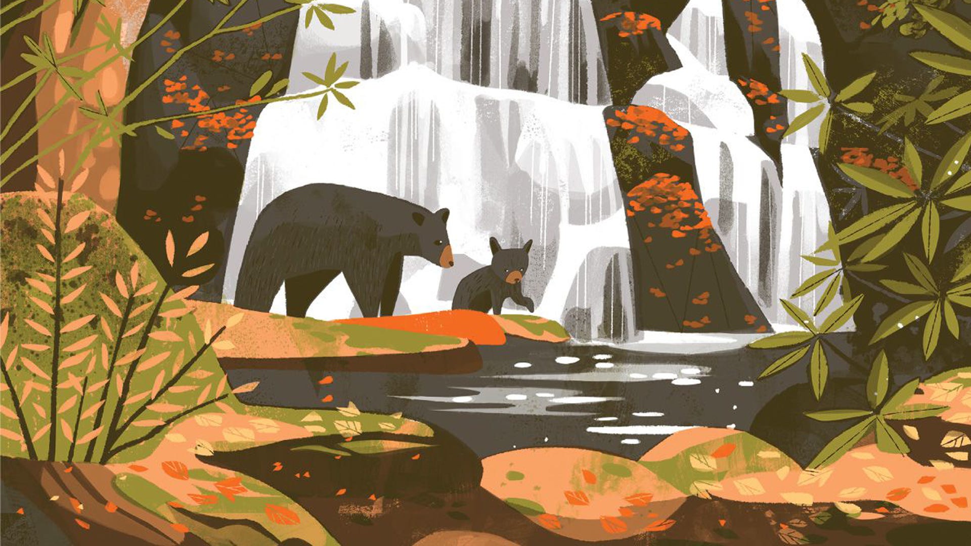
Our very own Wheels made sure to check that this particular entry made it onto the list of best board game box art. But he needn't have worried, because of course Parks is here. Dicebreaker has been somewhat enamored with Parks since it released in 2019, and a big reason for that adoration has been because of the game’s artwork. Based on the Fifty-Nine Parks art project - which was intended to celebrate the country’s protected natural trails through art - the box art for Parks is breathtakingly beautiful.

The use of charcoal perfectly captures the natural beauty of the landscape, with an adult bear and its cub approaching a waterfall being a delightfully picturesque image to put on the box of a board game. The soft brush lines used almost imitate the delicate texture of the very moss and fauna itself, whilst the muted colours help to soften the image even moreso. It looks like something you’d find on a postcard you’d collect on a hiking holiday - which is suitable, considering that’s what players are doing in the narrative of Parks - it’s certainly an inviting image to basically anyone with eyes. Parks’ box art ensures that it deserves a place on anyone’s shelf.
Buy Parks on Amazon US and Amazon UK.
8. Flip Ships
The striking colours and imagery of Flip Ships’ box art are sure to catch the eye
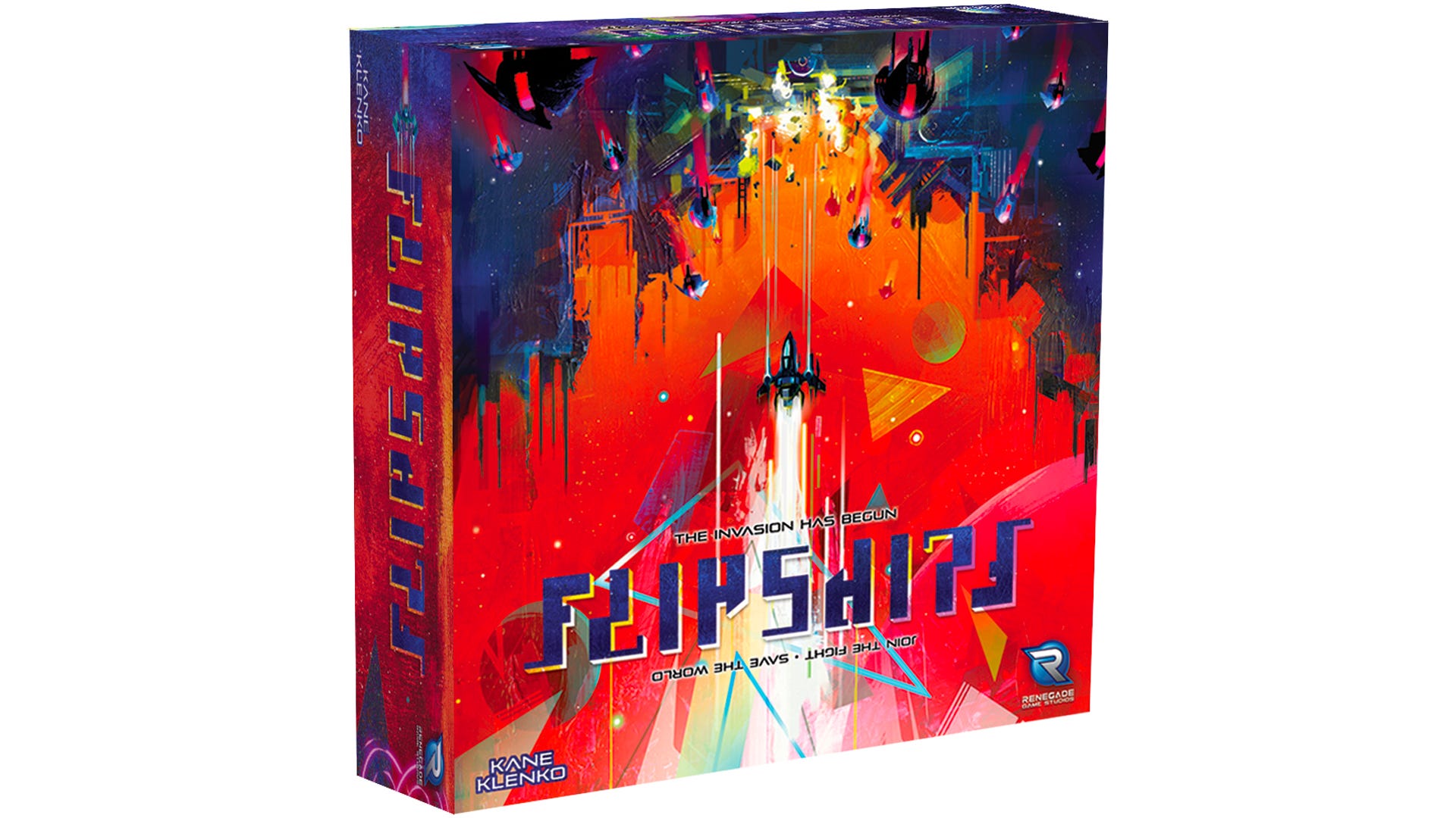
Kwanchi Moriya deserves to be a household name in the tabletop gaming industry, considering the sheer amount of amazing box art they’ve created over the last few years. Besides making the box art for such attractive looking titles as Bosk and Dinosaur Island - there was a point when they were the creator of multiple entries considered for this list - Moriya is the artist behind the front cover of the sci-fi dexterity board game Flip Ships.
Displaying an abstract landscape filled with intersecting geometry, the box art for Flip Ships is unbelievably striking. How the hot pinks contrast so dramatically with the burnt oranges and midnight blues not only makes the cover for this game simply jump out at you, it also helps to fully separate the sky from the base that’s being fired on by the spaceship that serves as the image’s central focus. You can even see how the brushstrokes have been made extra thick to trick the eye into thinking that the base is a 3D image, thereby further contrasting the two sides of the box. The two halves of the cover art appearing so different seems even smarter when you realise that the box can stand either way up and still make sense. Even the title is designed to be read from both angles. Kwanchi Moriya, everyone.
Buy Flip Ships on Amazon US and Amazon UK.
9. Deception: Murder in Hong Kong
Get in the mood for a police procedural drama with the box art for Deception
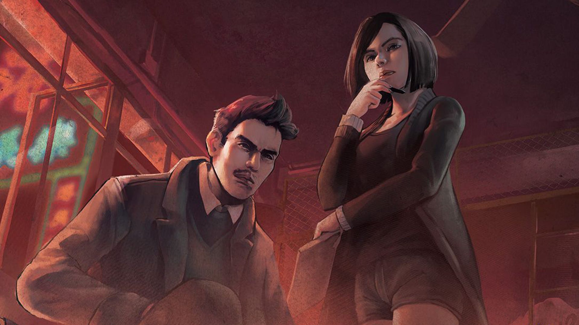
It’s an deniable fact that a large part of the appeal behind playing Deception: Murder in Hong Kong - the social deduction board game about investigating a terrible crime - is the atmosphere it manages to build. From discovering each new clue, to interrogating a suspicious player, praying that someone you trust isn’t lying or hoping that you aren’t discovered yourself - playing Deception is an immensely immersive experience.
The box art for the game expertly communicates this atmosphere through its use of moody lighting, with the colour red hinting at the themes of danger and emergency, and the liberal application of smoke conjuring up images of a big city teeming with dirty secrets. Artists Marcin Adamski, Ben Carre, Tommy Ng and Ari Wong clearly knew what they were doing with the framing of this box art, putting the limp hand of a victim in the forefront - indicating that something sinister has happened - whilst the two detectives loom in the background, their frowns further painting a picture of a mysterious crime scene. The front cover of Deception does a fantastic job of letting the players know exactly what they’re in for - a pulpy and tense board game about being an honest cop in a corrupt world.
Buy Deception: Murder in Hong Kong on Amazon US and Amazon UK.
10. Skull
A simple, yet unforgettable box art design has helped to cement Skull as an all-time favourite
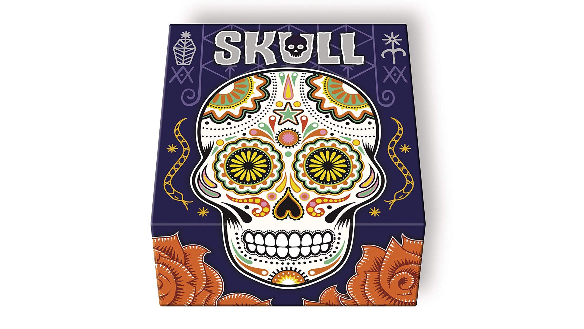
Who knew that a tabletop game that can literally be played using beer mats would have some of the best board game box art? Skull doesn’t have a particularly solid theme - though it’s possible that the use of skulls could be referring to the sense of danger players might feel during the bluffing game - and yet its box art remains one of the most recognisable in modern tabletop gaming. This is likely because its creator Hervé Marly, who also happens to be the artist behind other examples of simple-but-effective box art such as The Werewolves of Miller’s Hollow, has made something so eye-catching.
The imagery is definitely evocative of Mexican folk paintings - though Marly is originally from France - due to use of bright colours and intricate patterns. Obviously, the central focus of the skull also hints at Dia de Los Muertos, the Mexican festival of the Day of the Dead, as does the use of the contrasting colours of purple, red and white. It’s fairly abstract, but it’s beautiful and memorable. The lack of clear theme, but striking art style, is almost designed to tempt players to open the box and find out more, If they do, then players will be in for a treat, as the components of Skull are equally as gorgeous as the box art.