Mörk Borg’s artless, plain-text edition costs nothing and finally adds accessibility.
This should be a day-one feature for tabletop RPGs.

Even if you’ve never played Swedish tabletop RPG sensation Mörk Borg, there’s a pretty good chance you’ve seen the cover or heard folks discuss it at the table. Its reputation has transported the doom metal artbook from oddity to award winner and, most recently, to a strange object of ire.
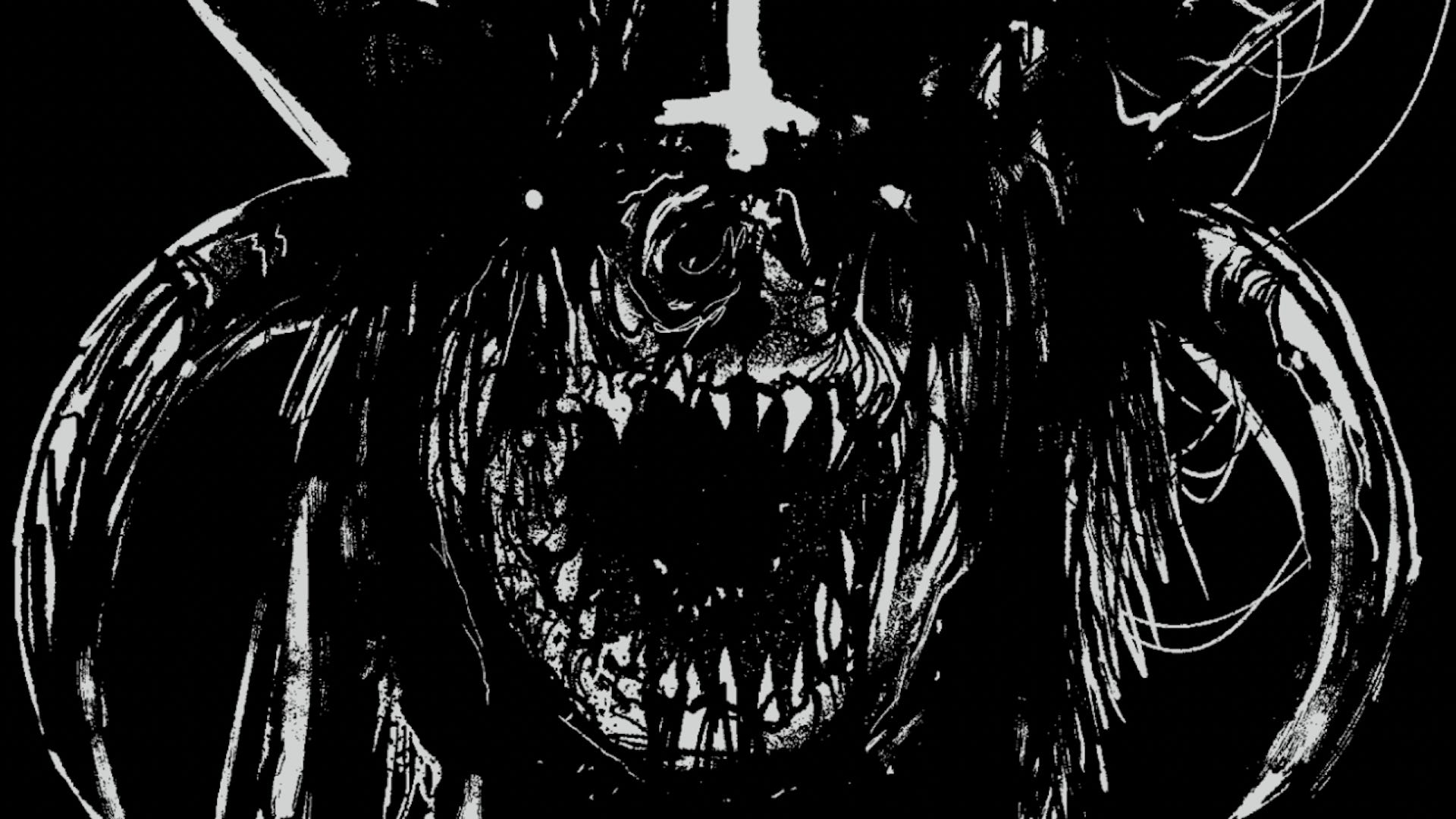
Its creators recently published a plain-text version of the rules that drops all the illustrations in exchange for a more accessible format available at no cost. Mörk Borg: Bare Bones Edition contains just Stockholm Kartell and Ockult Örtmästare’s text that comprises the core book, which was first published in 2019. It’s more than a little odd to read the book without Johan Nohr’s gruesome illustrations, but the trade-off is an increased useability and accessibility that should be standard practice in the tabletop industry.
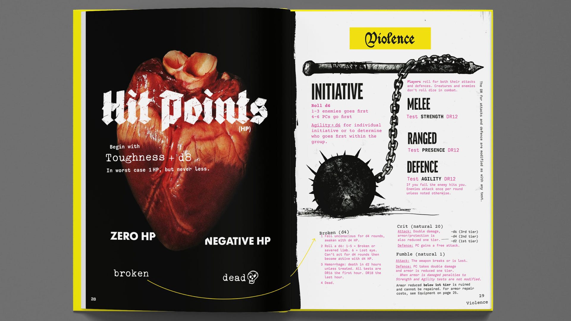
Mörk Borg was a polarising RPG book nearly from the jump. The Kickstarter campaign describes it as “Rules light. Art heavy” and a “spiked flail to the face”. Page mockups depict brief paragraphs of rules text or random tables adorning the space around the kind of thick, scrawling artwork you’d expect from a warehouse concert in the middle of a Nordic forest.
It wholly embraces the ‘art book you can play’ aesthetic, which seemed to rub players’ expectations the wrong direction. It’s almost a joke at this point to post online about the Mörk Borg’s unreadable layout, to the extent that one r/osr user had a quote from their diatribe pulled to use in the book’s marketing. The famous edict to burn the book at the end of a campaign seems to be a cheeky twist on this now deleted Reddit account’s distaste for “Portland hipster garbage” full of “pages of shitty metal album cover doodles”.
More measured criticism admits that the system tucked away in the white space between anatomical hearts and vaguely Catholic-looking beheadings is solid, if not groundbreaking. Mörk Borg endeavours to recreate the 1980s tabletop RPG experience best exemplified by the D&D basic set (often stylised as B/X), keeping the rules as light as possible in favour of big vibes. This design follows other entries in the OSR movement, such as Knave, Into the Odd, The Black Hack and Old School Essentials, but with much more emphasis on selling the tone of the world through its art book presentation.
Why, then, release a version of the game that drops all of that idiosyncratic design? Flipping through the free-to-download file shows the grim, death-obsessed poetry and pulp genre descriptions in an artistically flattering angle, much like turning on the lights in a haunted house or learning how a magic trick is performed. It becomes abundantly clear how much of Mörk Borg’s popularity is derived from being the weird little guy of tabletop RPGs, a fairly simple and reliable friend who wears the most ridiculous outfits and somehow always pulls them off.
As plenty of players and designers have noted, often with frustration, Mörk Borg’s gorgeous art-heavy layout comes at the cost of readability for a significant portion of the tabletop audience. Those who rely on screen readers to parse text or have visual processing disorders can’t interact with the original PDF at all. The overwrought gothic text fonts and wonky composition mires the rules in too much noise. To these players, it doesn’t matter how fun it is to flip through the page and simply bask in its vibes because the book feels like an intentionally antagonistic choice.
The Bare Bones Edition is a major step towards making the game fully accessible, even if it does come nearly three years after its initial publication. Those with assistive devices can better read the book - though many are pointing out a full text file conversion would be best - which has the added benefit of being much easier to reference for one specific rule or random table.
Mörk Borg’s plain-text conversion is a welcome sight but not an unalloyed win. This sort of accessibility needs to be addressed earlier in the design process and especially when the book breaks the mould in such a peculiar way. The reaction to its release has been overwhelmingly positive, showing a real enthusiasm for including plain-text versions of books alongside their full release.
I’m cognizant that placing this demand on individual designers and small teams is perhaps unreasonable and also missing the point. Mörk Borg is published by Free League, one of the larger outfits in tabletop with a history of celebrating odd projects with aesthetics in spades. Though they were not involved in creating the Bare Bones Edition, their adoption of plain-text versions as a matter of course would go a long way to establishing better accessibility as an industry standard instead of a neat feature three years down the road.